WESTROCK Church is a growing church plant in the West Valley of Phoenix, Arizona, with a clear mission to make disciples and reach their city with the Gospel. From the beginning, this project required more than a logo. It needed a visual identity that felt strong, grounded, and deeply intentional, while remaining accessible and culturally relevant to the community it serves.
Our Approach
We approached the WESTROCK Church brand by first listening. Before any design work began, we took time to understand the heart of the church, its discipleship pathway, and the unique context of the West Valley. Phoenix is bold, sunbaked, resilient, and uncompromising, and the brand needed to reflect those same qualities.
A key goal was to create a brand identity that felt masculine, yet family oriented. Strong without being aggressive. Bold without being closed off. The visual system needed to resonate with men while remaining warm, welcoming, and approachable for families and all generations. Simplicity, clarity, and theological depth guided every design decision.
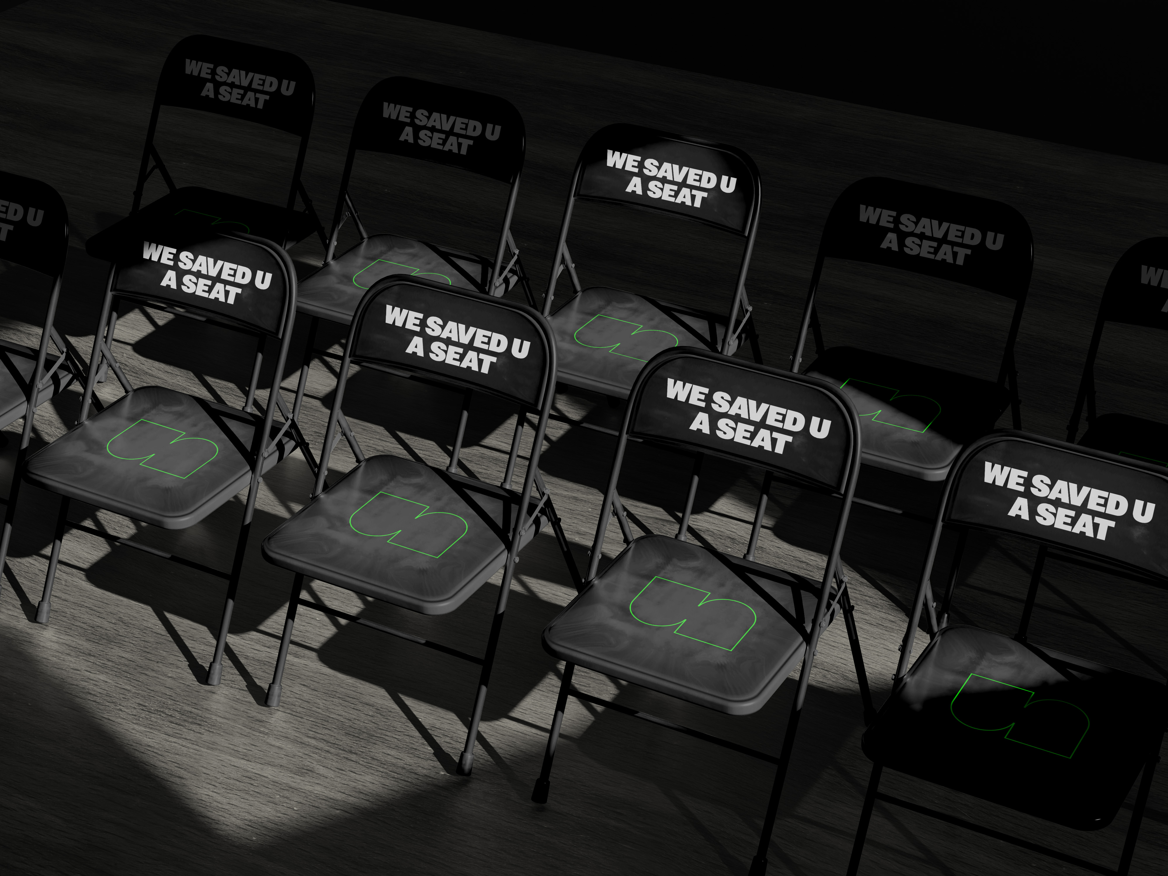
Our aim was to create an identity that felt timeless rather than trendy. Something that could live on a Sunday morning banner, a social post, a hoodie, or a church building sign without losing its meaning or strength.
The Logo Meaning
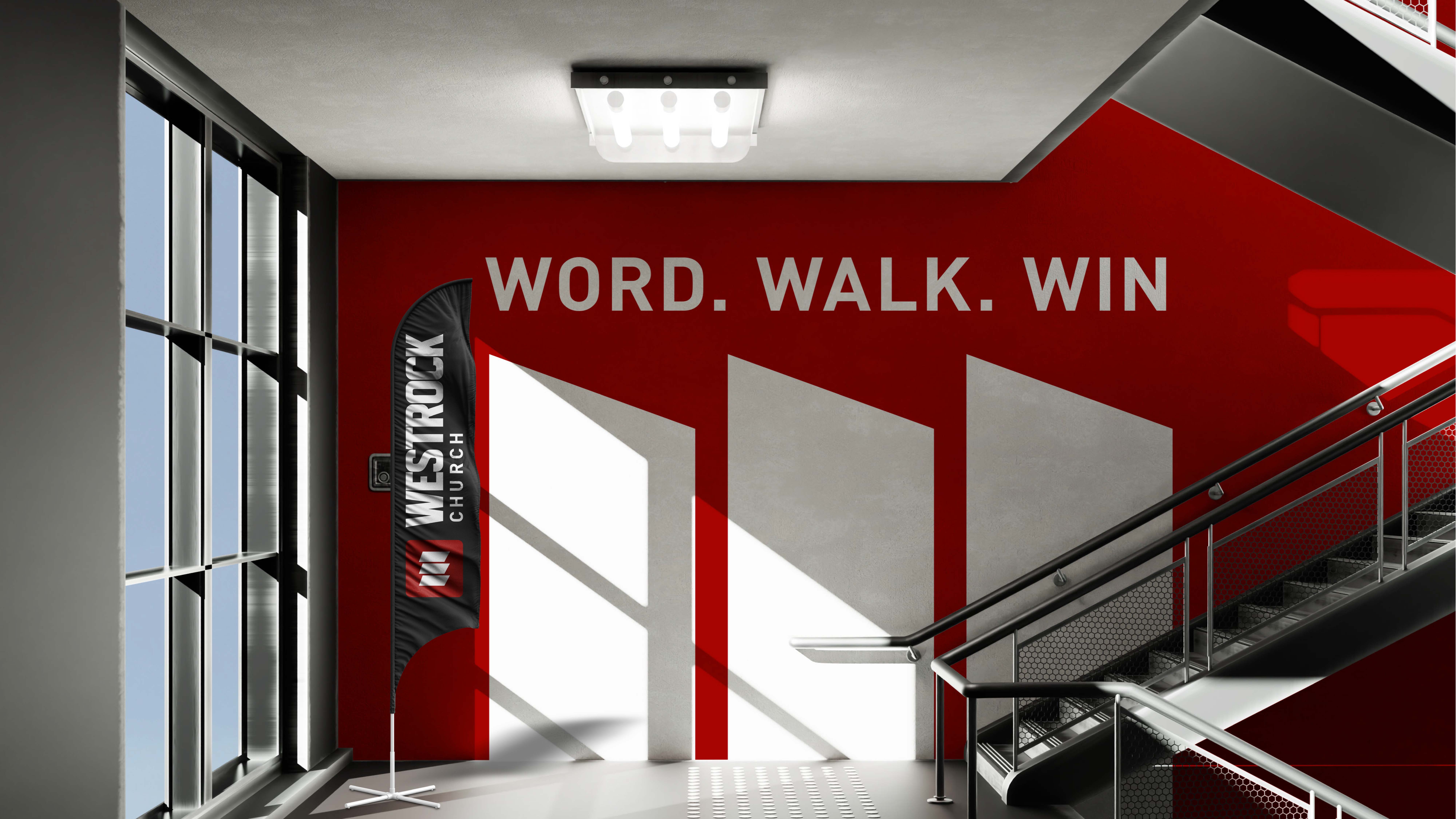
At the center of the brand is a single “W”, representing WESTROCK. The letterform is strong and unified, symbolizing a church built on the solid foundation of Christ.
Within the mark are three doors, visually embedded into the W. These doors represent WESTROCK’s discipleship journey:
WORD
People come to know the Word through compelling, clear, and culturally relevant Bible teaching centered on Jesus.
WALK
People walk together in authentic community and in the way of Jesus, growing, practicing spiritual disciplines, and learning to follow Him.
WIN
People win by saying “no” to sin and “yes” to Jesus, while joining the mission of winning the West Valley to Christ through the gospel.
The door imagery communicates invitation and movement. Faith is not static. It is a journey, one step at a time.
Color & Visual System
The color palette was developed to reinforce strength and approachability. Deep reds evoke conviction, sacrifice, and the fire of the Gospel. Charcoal blacks and stone grays provide weight and stability, while clean whites introduce clarity, warmth, and balance. Together, the system supports a brand that feels confident, trustworthy, and family friendly.
The final result is a bold, memorable, and meaning rich brand identity that gives WESTROCK Church a clear visual voice. The logo is simple enough to be instantly recognizable, yet layered with symbolism that reflects the heart of the church and its mission. More than a logo, this brand equips WESTROCK Church to show up consistently across digital platforms, print materials, signage, and merch, all while staying rooted in who they are and why they exist. We are honored to partner with WESTROCK Church as they build on the Rock and reach the West Valley with the Gospel.