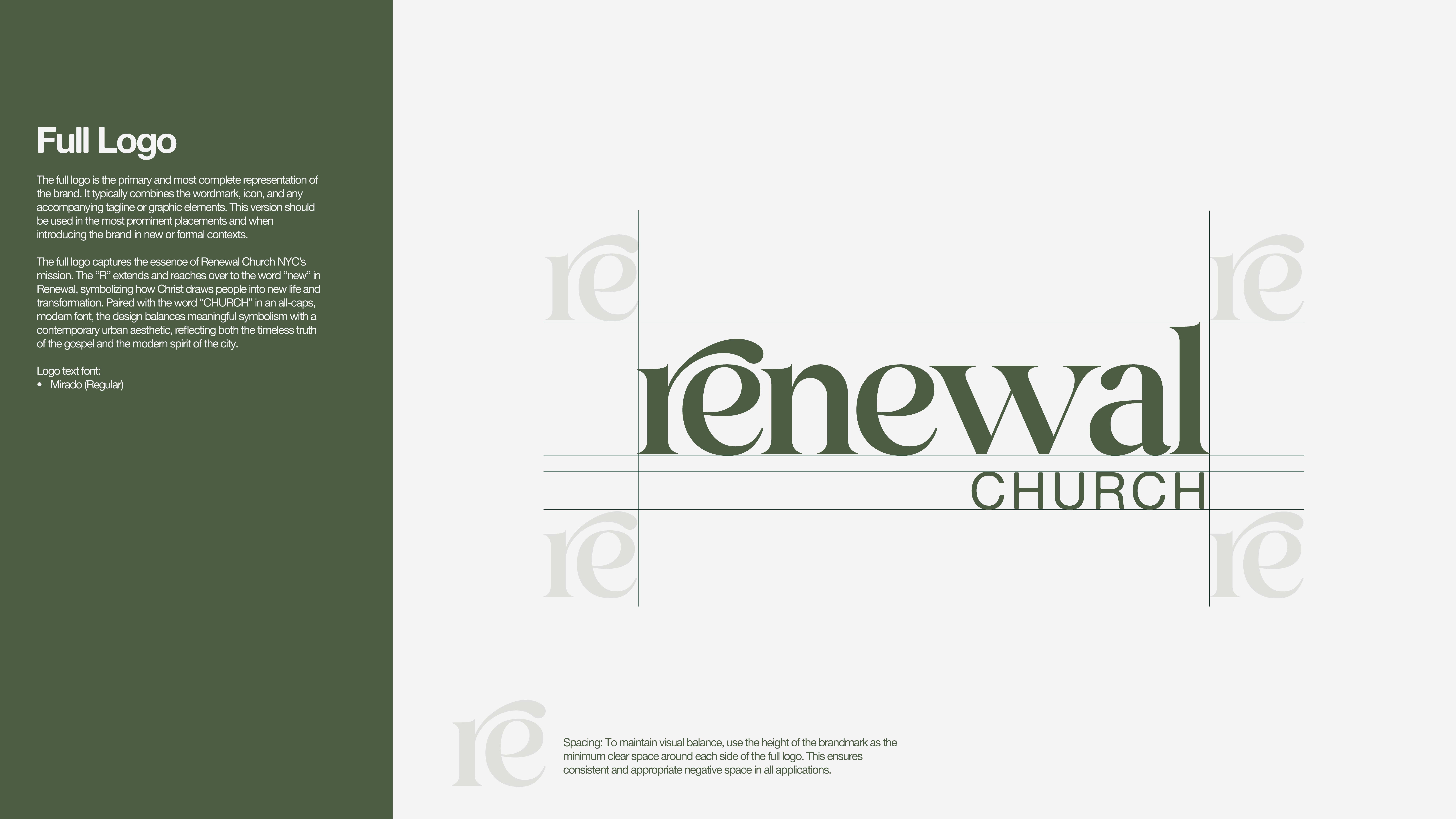
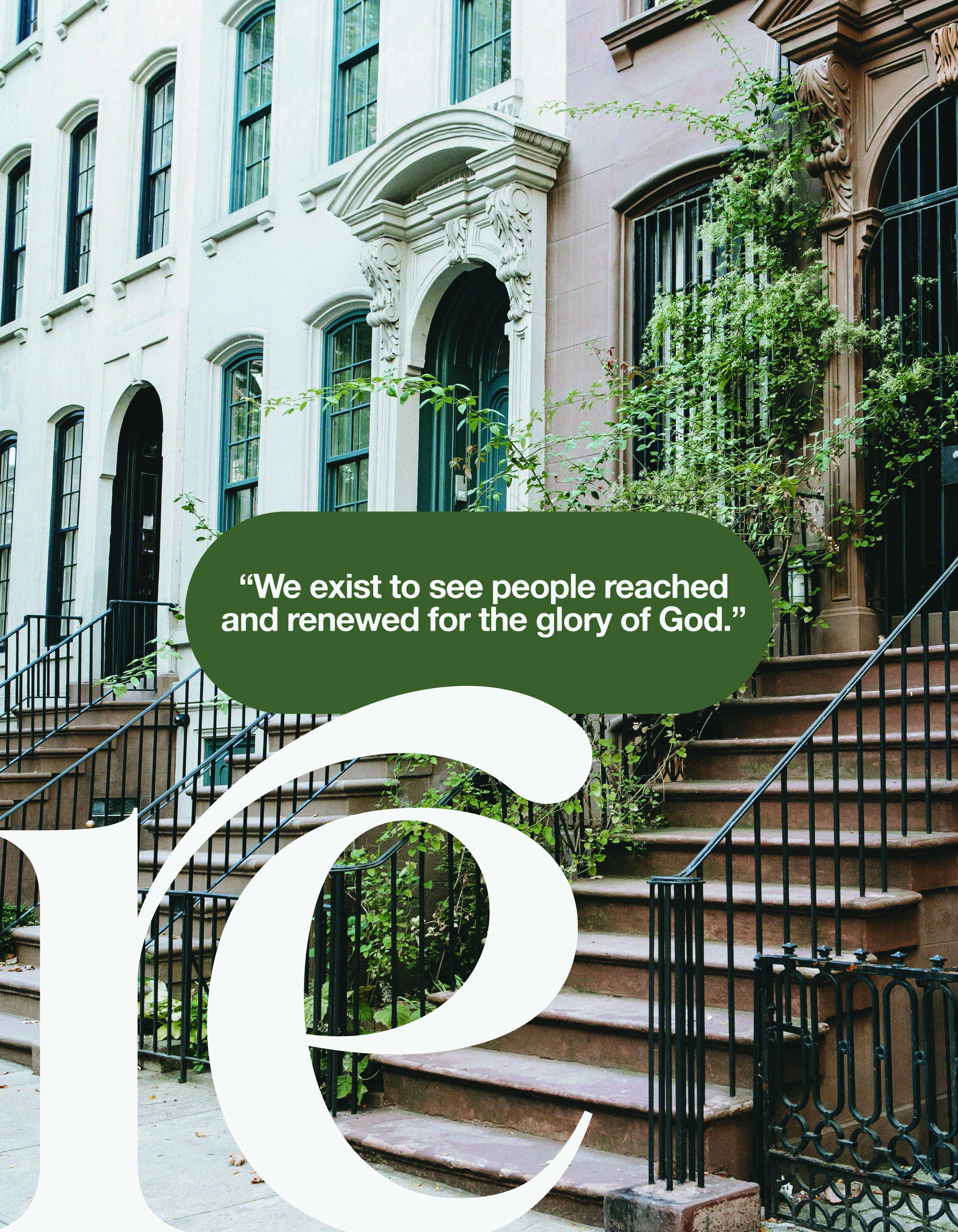

Our work began with a brand consultation with the lead planter, diving deep into the church’s mission, vision, and the unique context of New York City. Renewal’s very name points back to its mission—to see people reached and renewed for the glory of God. That conviction became the anchor for every design decision we made throughout the branding process.
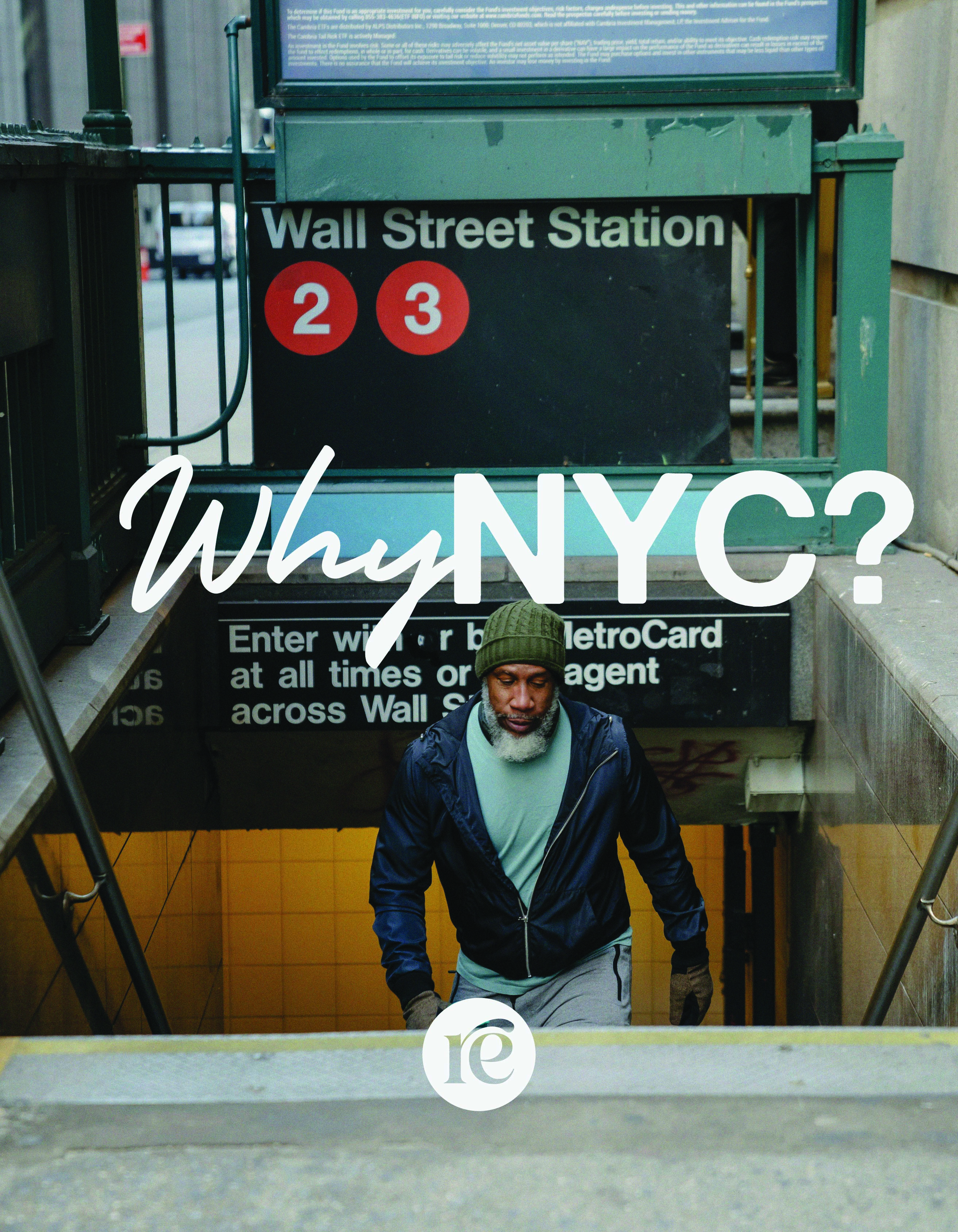
We conducted extensive research on the city, studying cultural trends, design aesthetics, and faith communities across Manhattan to ensure the brand identity would feel both timeless and iconic while remaining modern and approachable to their expected audience. From typography and logo design to color palette and applications, each element was carefully chosen to embody Renewal’s calling.
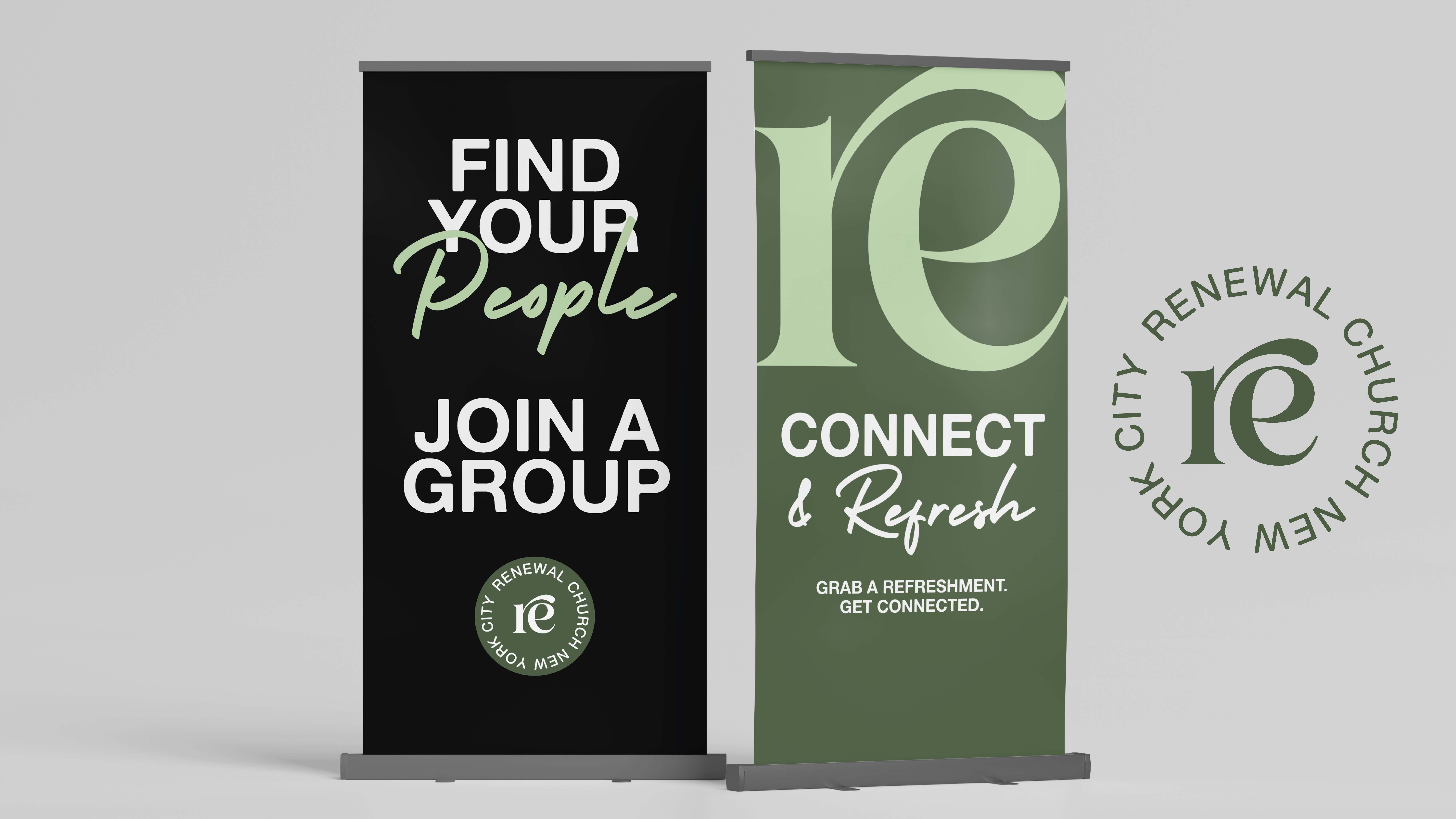
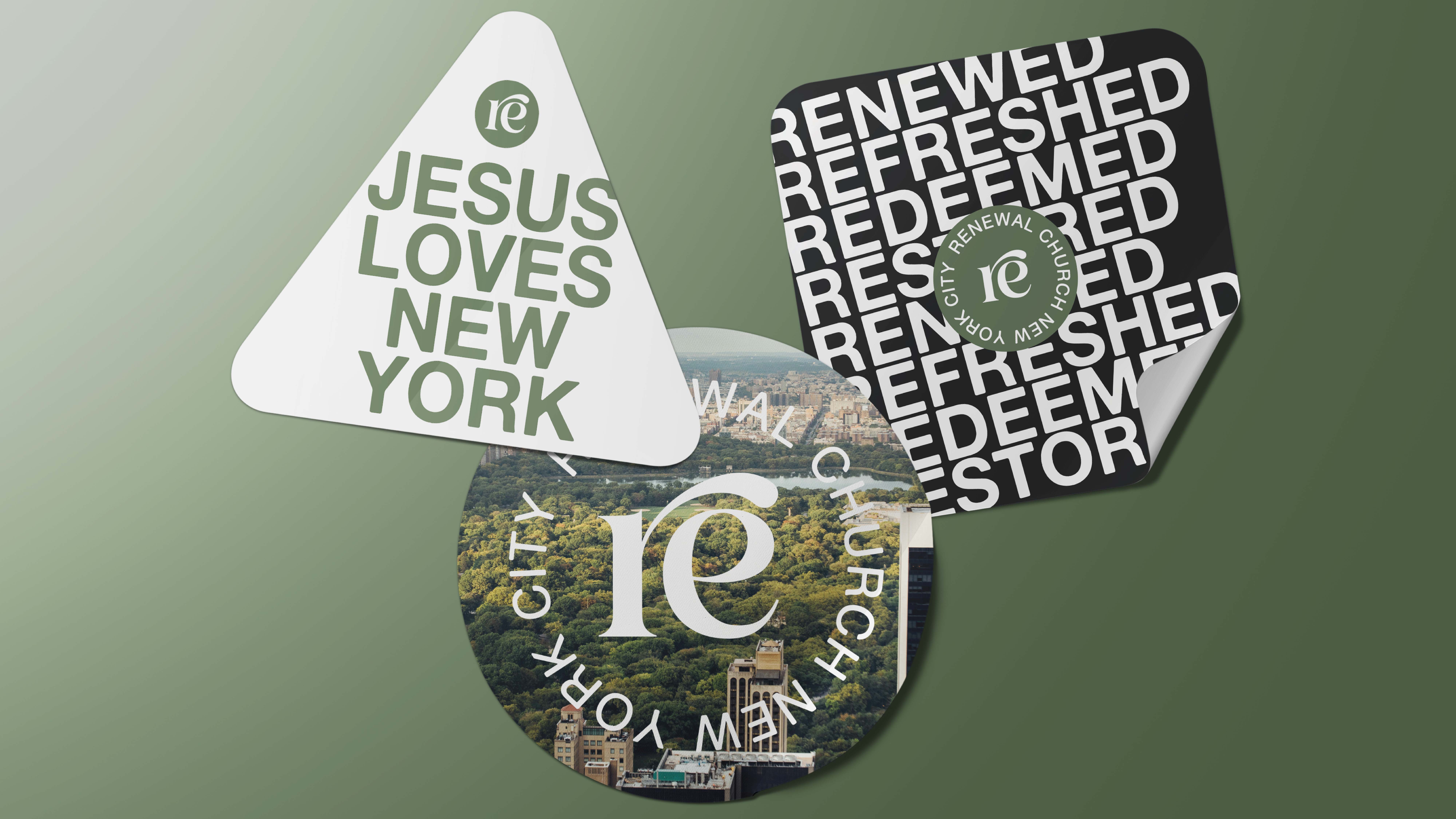
A defining choice was the use of green as a primary brand color—symbolizing new life in Christ while also connecting visually to the stunning natural landscape of Central Park, an oasis in the middle of Manhattan. Paired with clean lines and a refined logo system, the brand reflects Renewal’s desire to bring the timeless truth of the gospel into the fast-paced, ambitious culture of New York City.
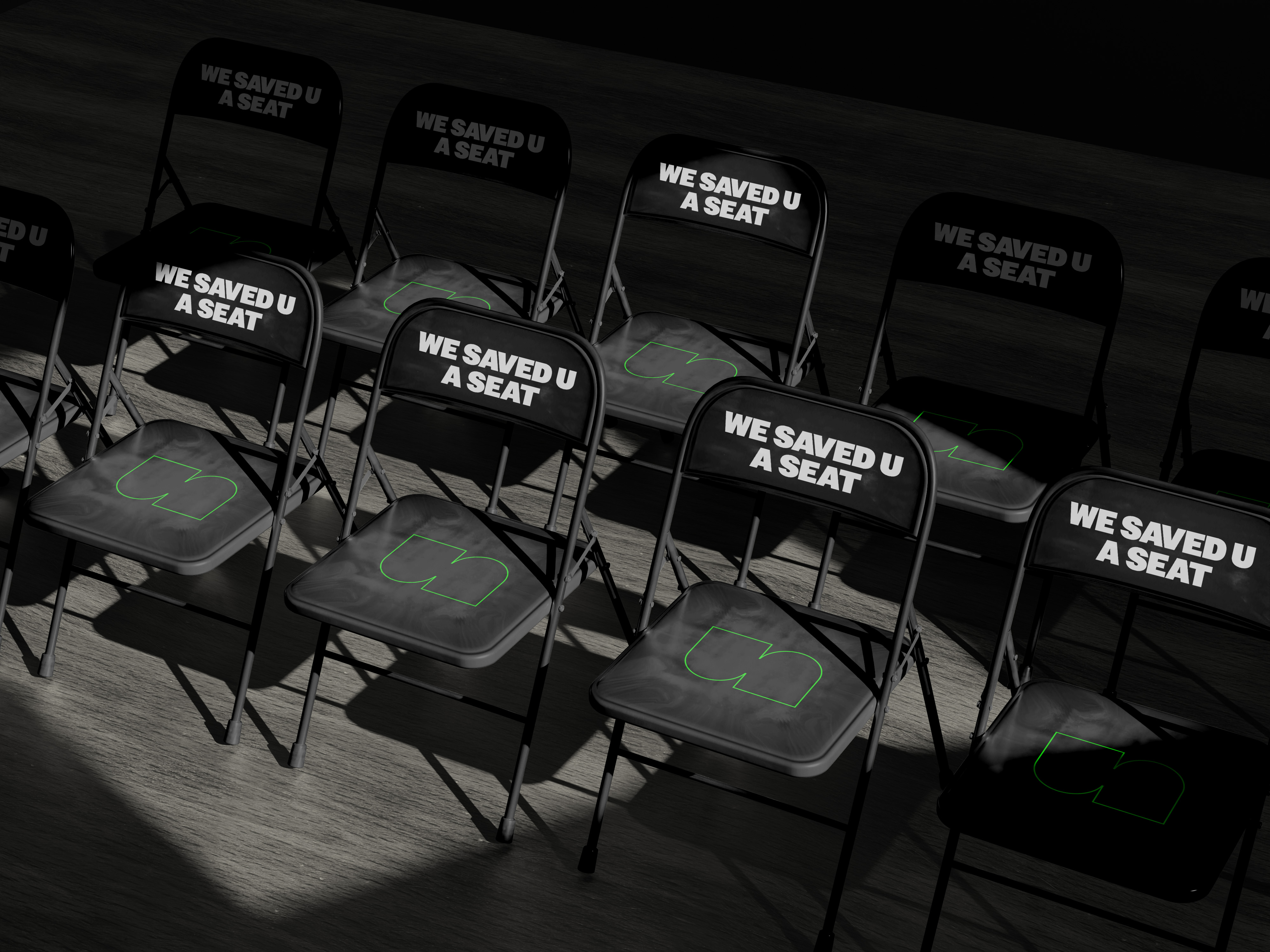
The resulting brand identity communicates Renewal’s vision to catalyze a movement of disciples and churches—rooted in Scripture, relevant to the city, and centered on Christ. Through this collaboration, Renewal Church NYC now has a strong visual foundation that captures both the vibrancy of Manhattan and the transforming beauty of the gospel, equipping them to launch with clarity, confidence, and connection as they step into the city on mission with God.