

Brand Director & Designer: Rafael Rodriguez
House of Disciples exists to build disciples who make disciples, creating a spiritual home where people from every background can encounter Jesus, find community, and be sent into the city on mission. As the church stepped into a new season of growth, they needed a brand that reflected both the vibrancy of Miami and the timeless mission of the Gospel. The goal wasn't simply to create a logo. It was to build a visual identity that could unify every ministry, every environment, and every future expression of the church.
The Branding Direction
Miami became one of the primary influences behind the creative direction. Rather than leaning into clichés often associated with South Florida, we drew inspiration from the city's warmth, energy, tropical landscapes, architecture, and cultural diversity. The result is a brand that feels bold, optimistic, and unmistakably local while remaining grounded in the mission of making disciples.
A vibrant orange serves as the primary brand color, representing warmth, invitation, movement, and the city's energetic spirit. It is balanced by deep charcoal, warm cream, and a rich teal inspired by Miami's tropical landscape, creating a palette that feels both contemporary and welcoming. Clean geometric layouts paired with expressive script typography communicate both strength and humanity, creating a church brand that is confident in its message while remaining approachable to those walking through its doors for the first time.
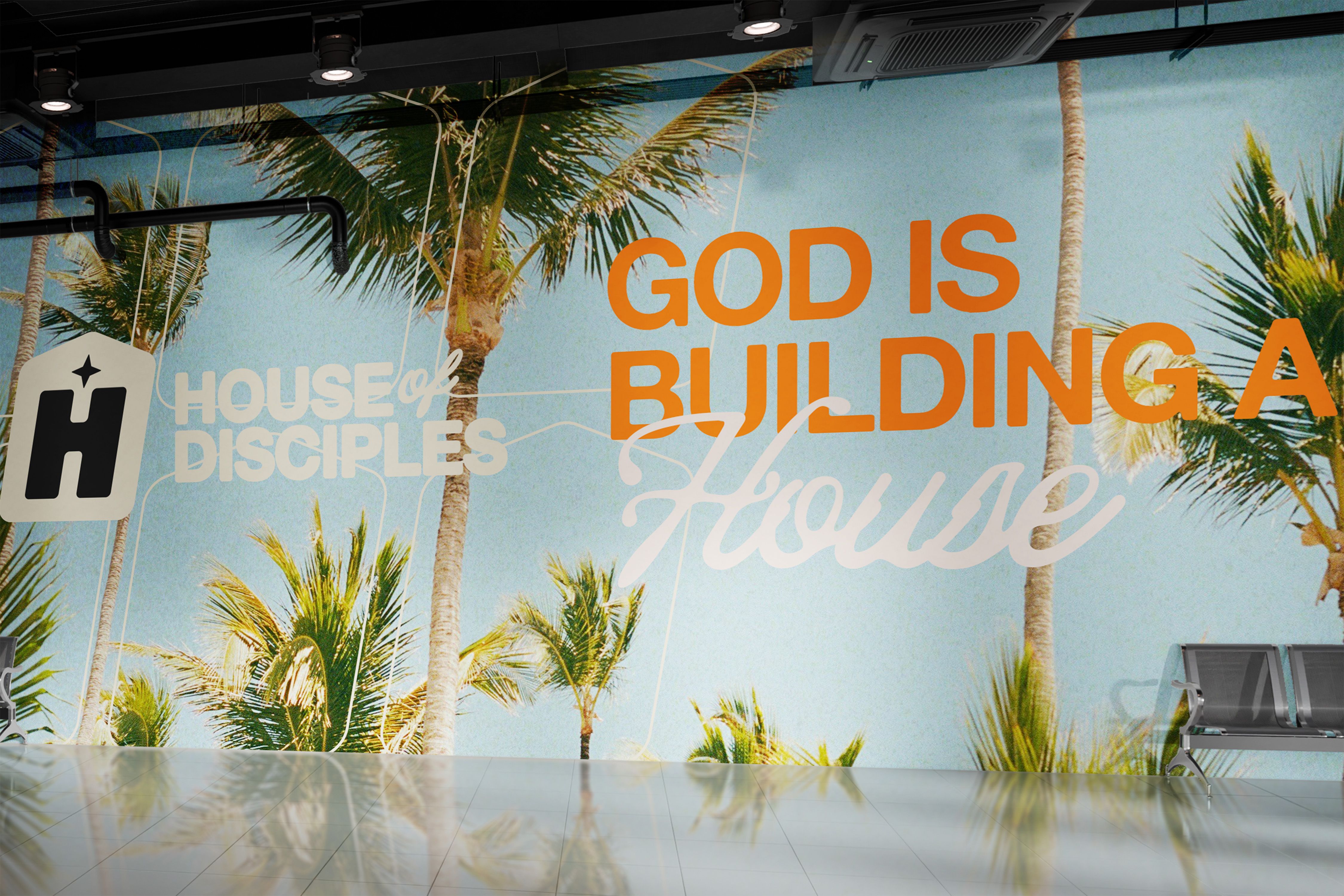
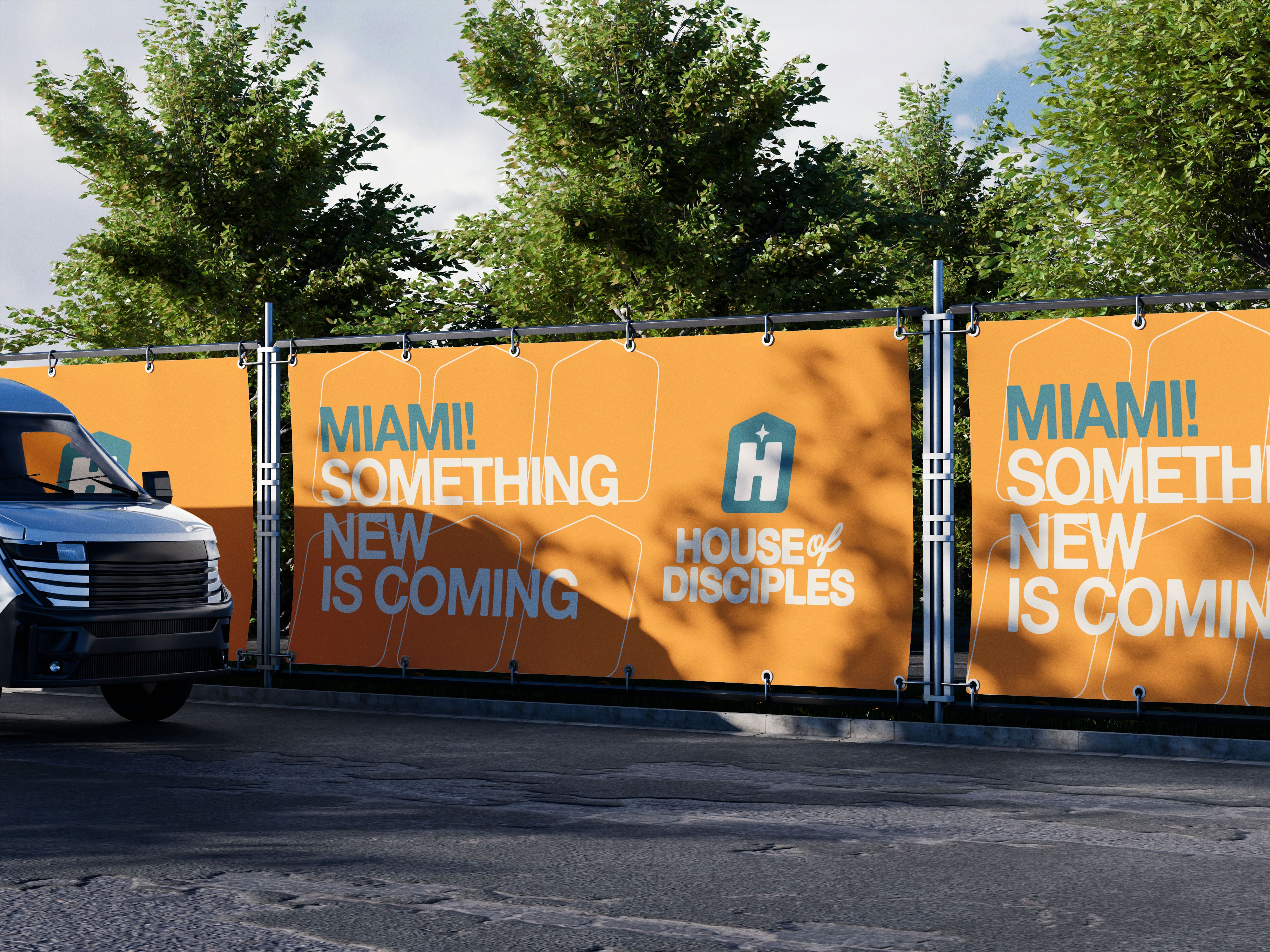
Throughout the identity system, subtle house-shaped line graphics reinforce the central idea that House of Disciples is more than a gathering. It's a home where lives are transformed.
The Logo
At the center of the identity is a custom "H" icon enclosed within the silhouette of a house. The mark immediately communicates the church's name while visually reinforcing its mission of building a spiritual home. A star positioned above the letterform symbolizes the light of Christ, pointing people toward Jesus as the foundation of the House.
The accompanying wordmark combines bold, modern typography with a handwritten script for the word of, creating a visual balance between strength and relationship. The result is a mark that feels memorable, versatile, and equally effective across signage, apparel, digital platforms, and environmental graphics.
Building a Family of Ministries
One of the primary goals of the identity system was scalability. Rather than designing disconnected logos for each ministry, we created a cohesive family of sub brands that could immediately be recognized as part of House of Disciples while giving each ministry its own personality.
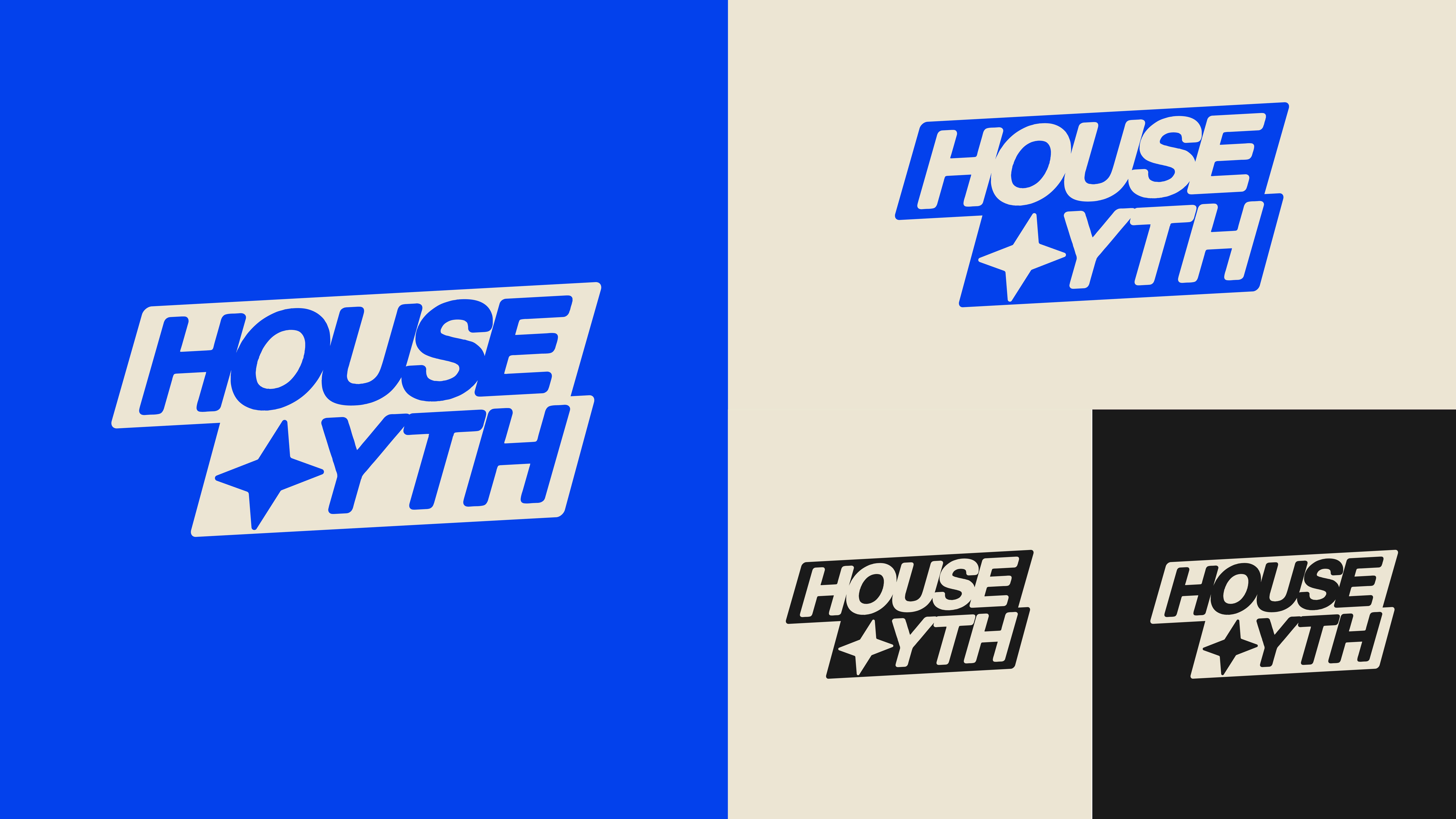
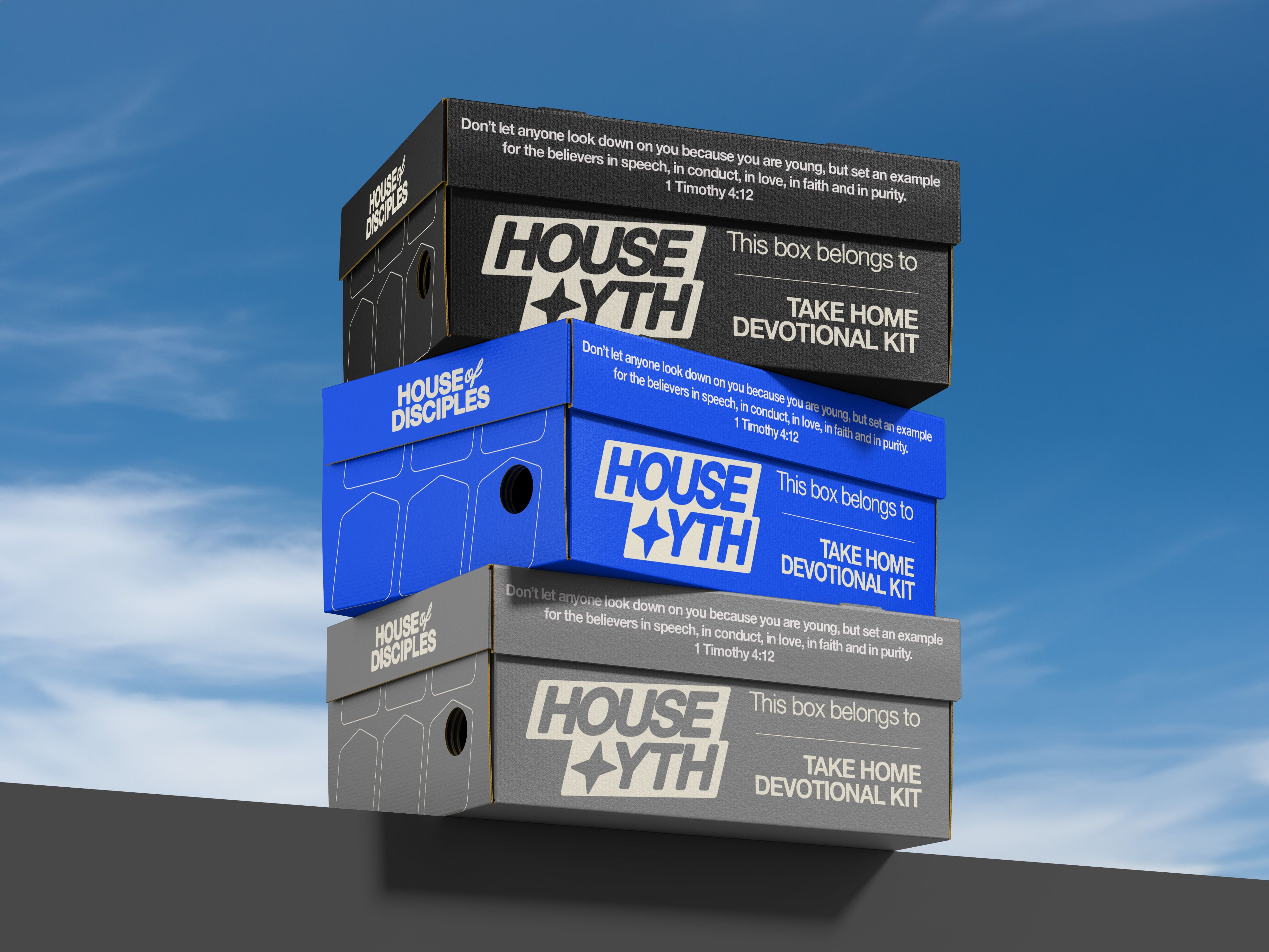
House YTH received a bold, energetic identity designed to resonate with students. Dynamic typography, confident layouts, and a striking blue color palette communicate movement, confidence, and a generation being equipped to lead.
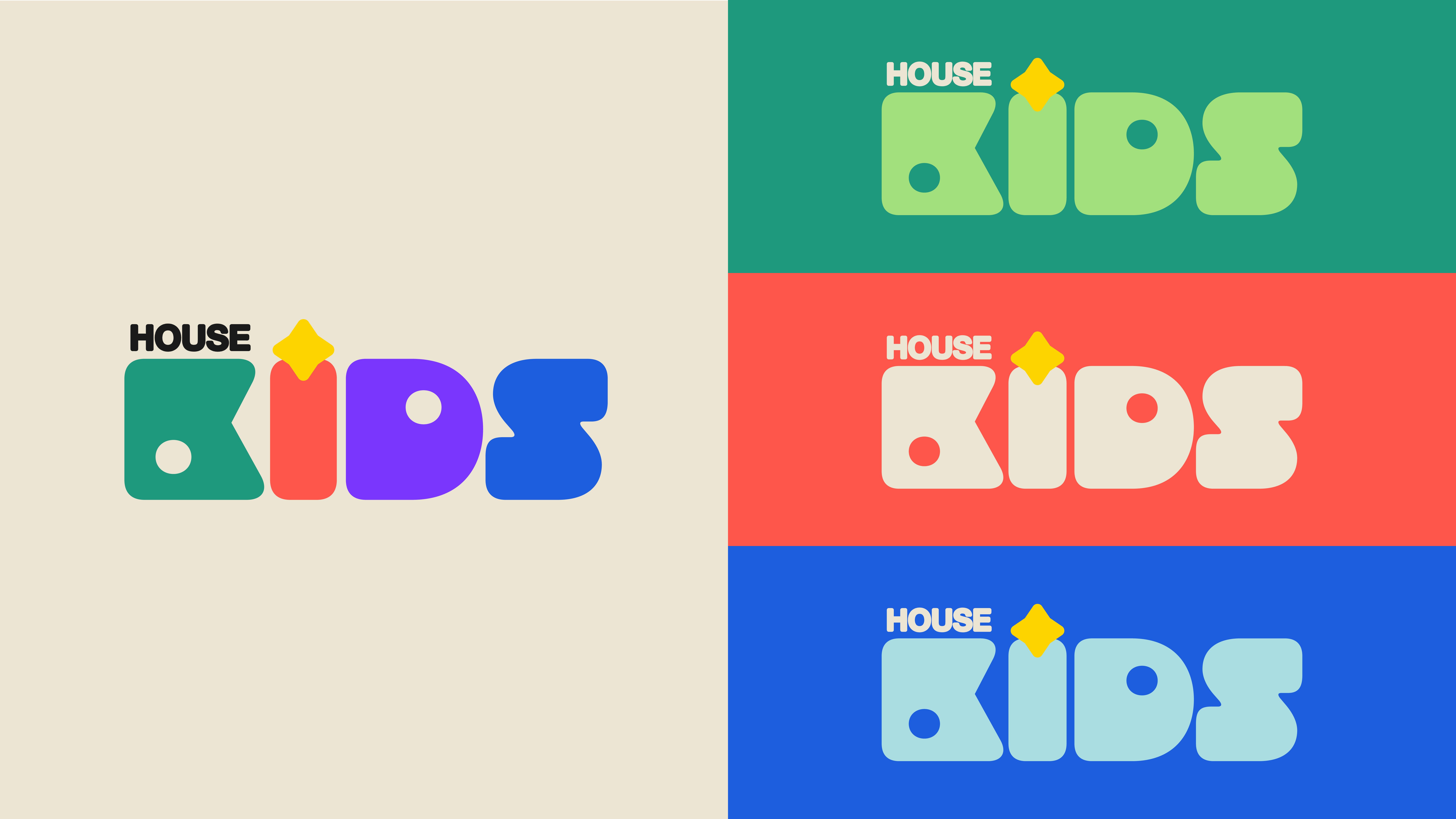
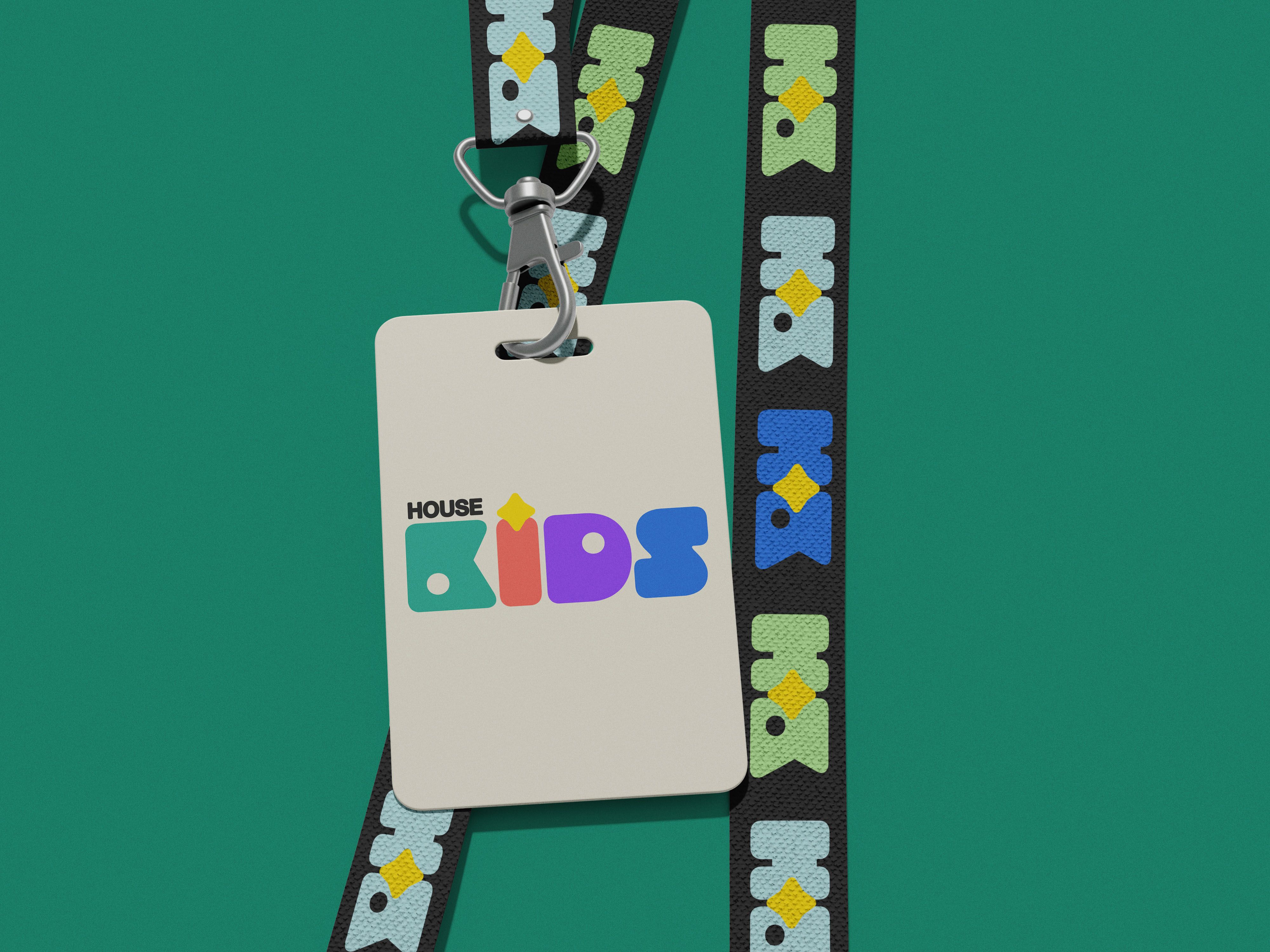
House Kids embraces a playful visual language built around colorful custom letterforms, vibrant colors, and approachable shapes. The identity creates excitement for children while remaining unmistakably connected to the parent church brand.
Together, these ministry identities strengthen brand recognition while allowing every age group to experience a brand designed specifically for them.
Beyond the Logo
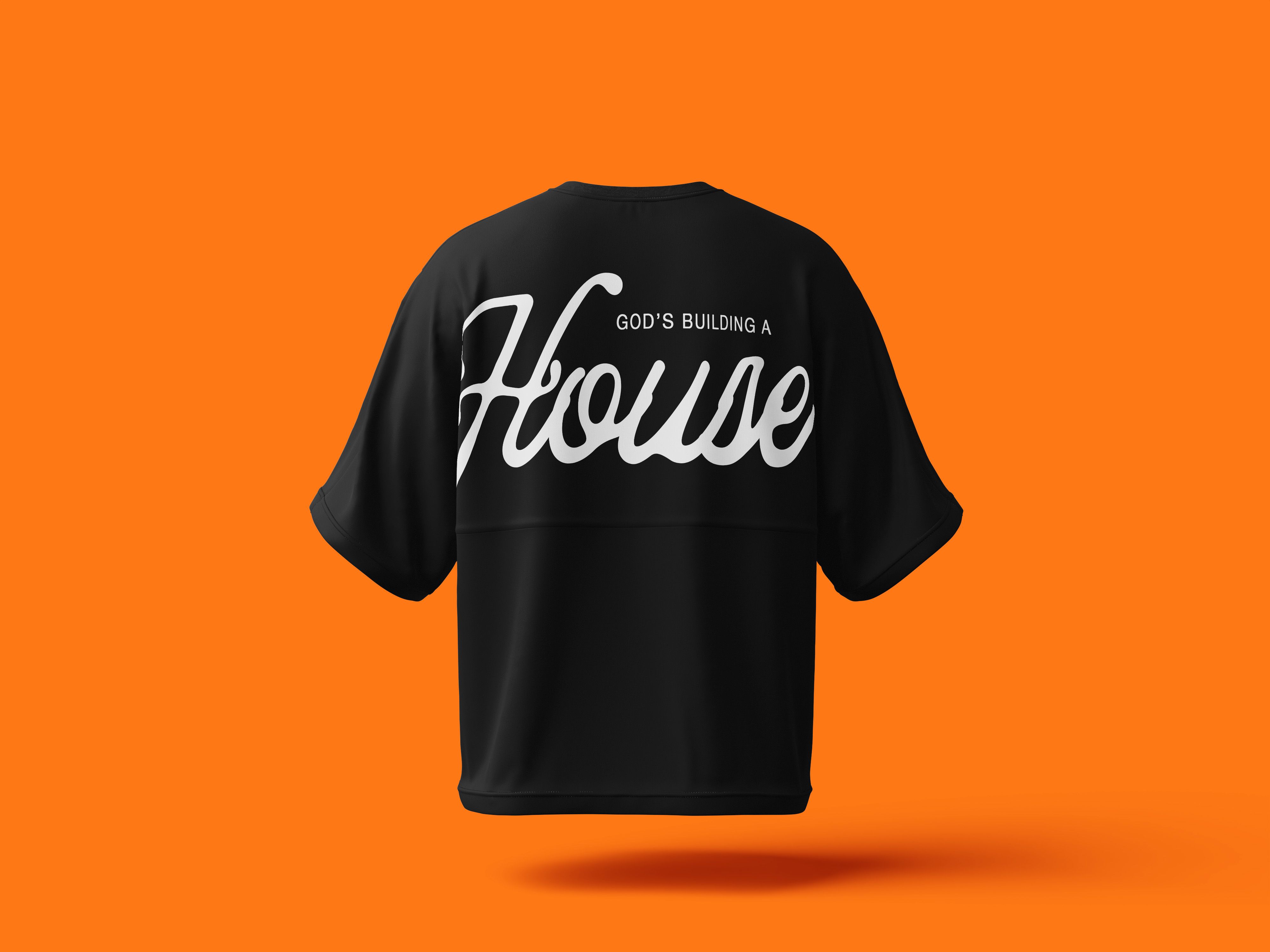
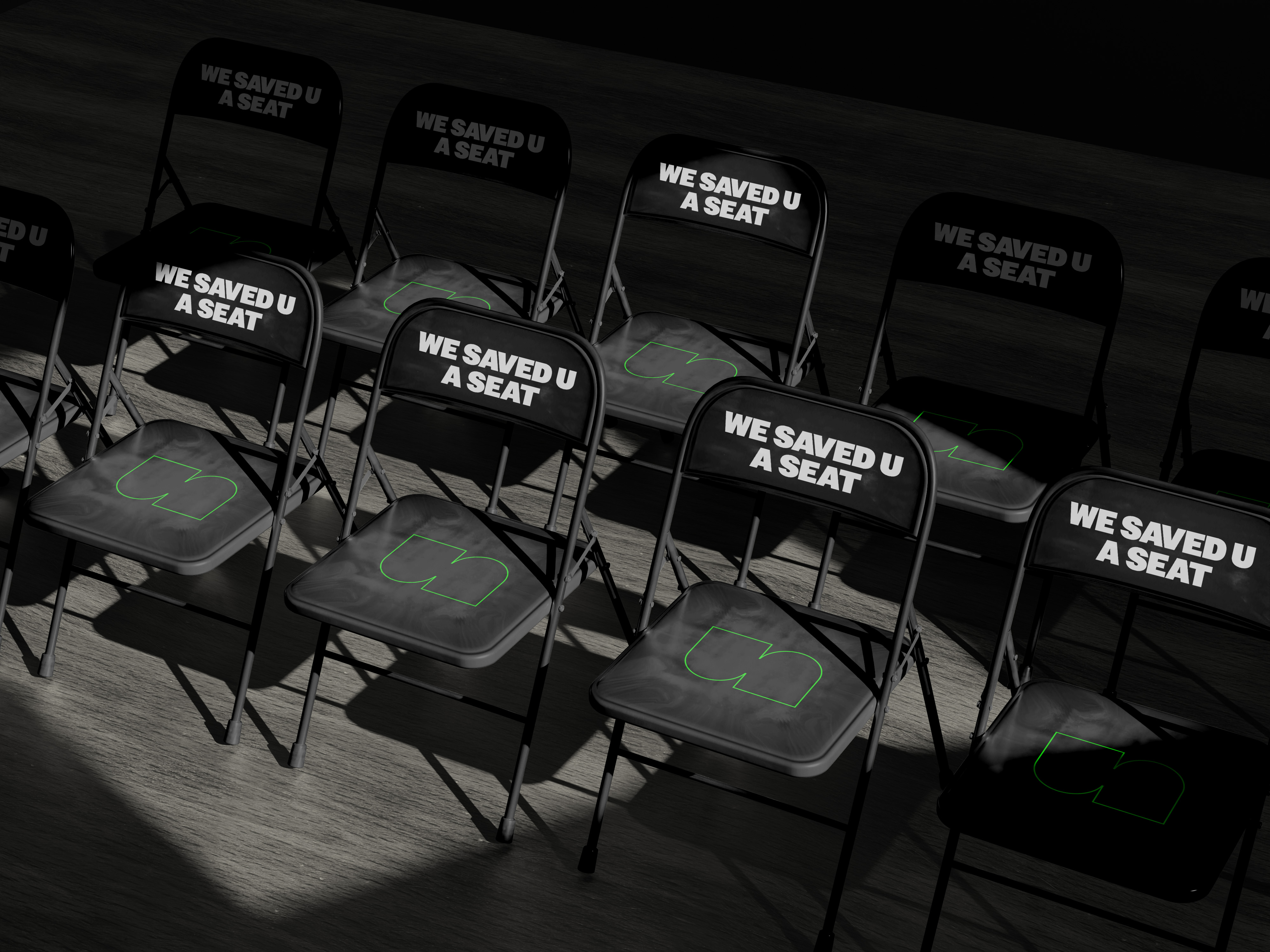
The project extended far beyond visual identity. We developed a complete creative ecosystem including environmental graphics, large scale exterior signage, welcome walls, apparel, event branding, ministry collateral, children's check in materials, youth devotional kits, and branded experiences throughout the church campus.
Every touchpoint was intentionally designed to reinforce the same message: God is building a House.
Whether someone encounters House of Disciples through a roadside banner, a T shirt, a children's lanyard, or a Sunday worship experience, they are met with a consistent visual language that communicates warmth, excellence, and belonging.
House of Disciples now has a bold, recognizable brand that reflects both the heart of the church and the spirit of Miami. More than a collection of logos and graphics, the project delivered a scalable identity system capable of supporting future campuses, ministries, events, and initiatives while maintaining a unified brand experience. The result is a church brand that feels unmistakably local, deeply Gospel centered, and built for long term growth, equipping House of Disciples to make a lasting impact throughout Miami and beyond.