Greenhouse Movement requested an identity that matches the strength of their mission. The branding needed to feel clear, modern, confident, and rooted in disciple making. The visual direction shown in the branding presentation guided how we shaped the full creative proposal.
Identity Rooted in Movement
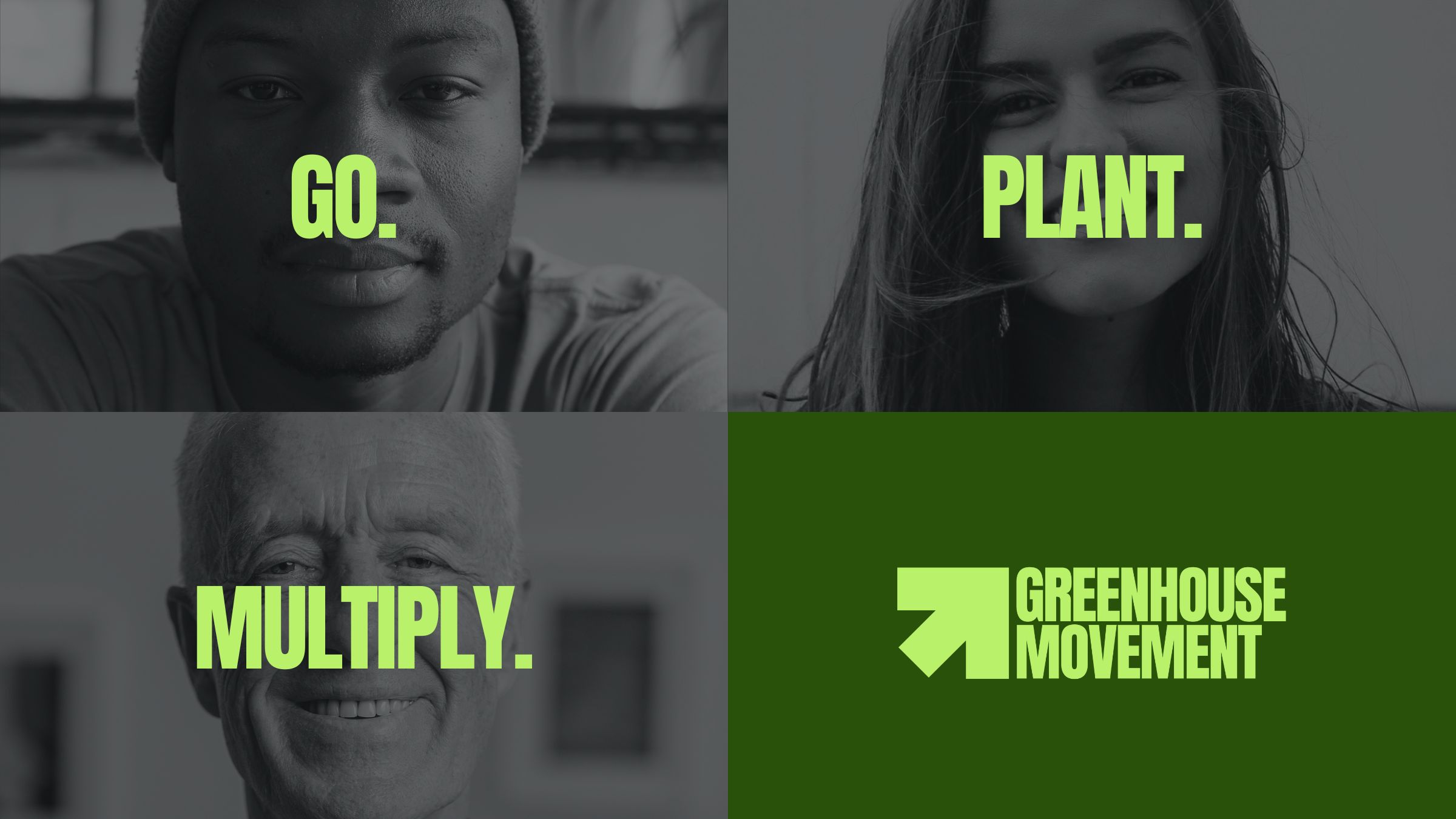
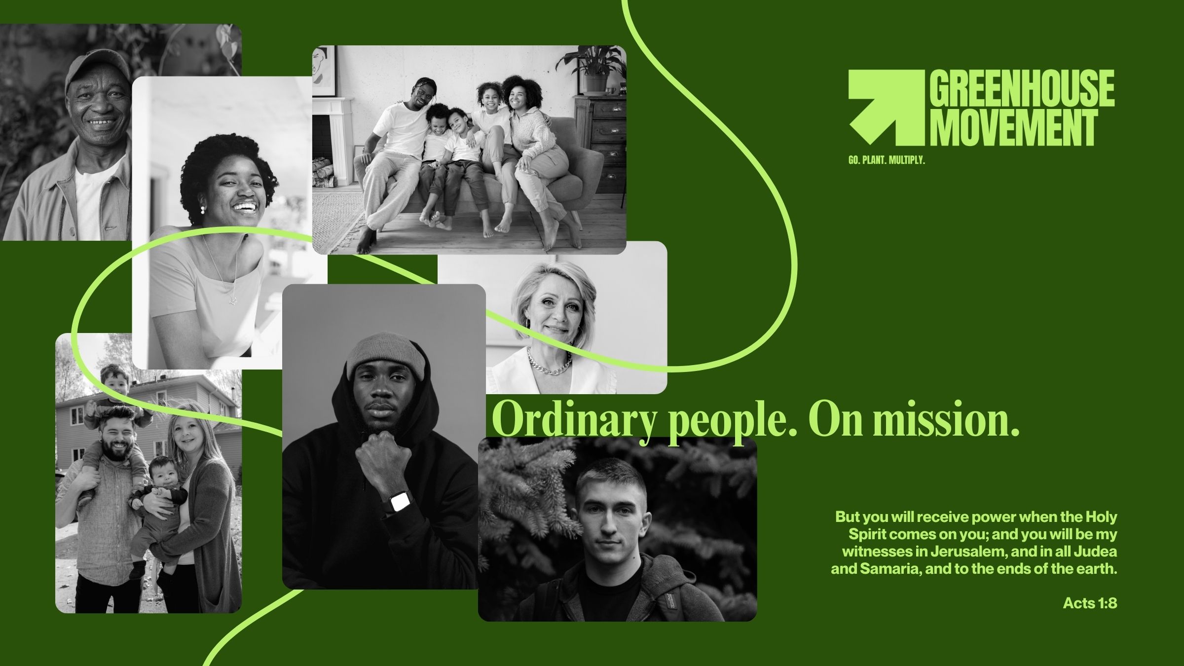
The upward arrow became the anchor of the visual system. It communicates action, direction, purpose, and the forward motion of a disciple planting movement. Paired with bold typography, the identity immediately signals clarity and urgency. The brand makes its message impossible to miss. Go. Plant. Multiply.
Color System
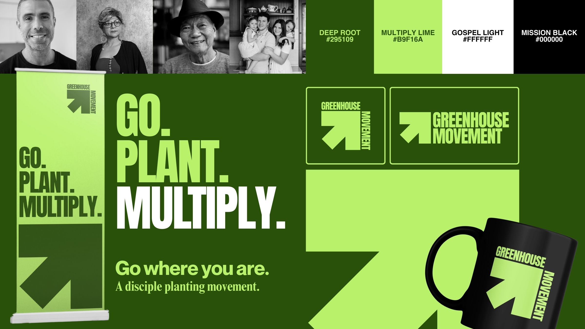
The palette is built with sharp contrast and energetic tones designed to stand out in every context.
• Deep Root reflects stability and spiritual depth
• Multiply Lime communicates energy, growth, and expansion
• Gospel Light keeps the system clean and readable
• Mission Black brings strength and grounding
Together, these colors create a unified look that feels modern, confident, and unmistakably Greenhouse.
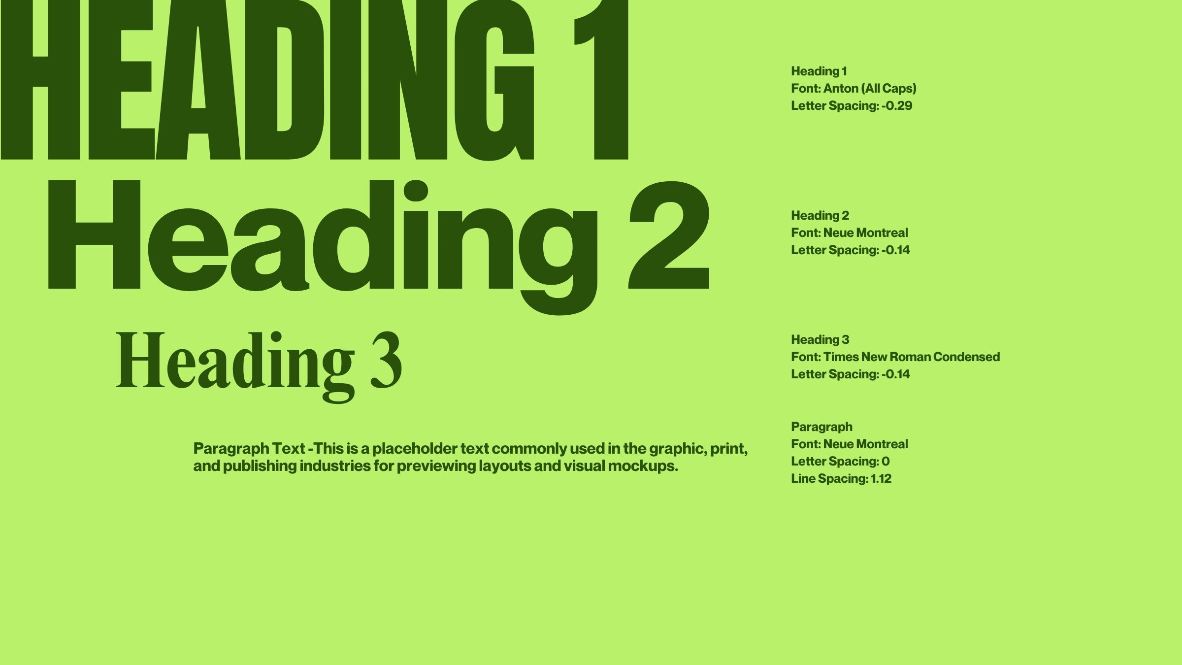
Typography and Layout
The type direction is fully aligned with the tone of the movement. Strong, bold, heavy lettering communicates conviction and momentum. Short phrases are stacked and broken into lines for emphasis, creating punchy statements that match the rhythm of the mission. Go. Plant. Multiply. Every line lands with purpose.
Messaging and Language
The brand language reflects clarity and urgency. It is simple enough for every person in the movement to carry forward and powerful enough to define the culture they want to build.
• Go where you are
• A disciple planting movement
• We plant churches that plant churches
Every phrase reinforces the call to multiplication.
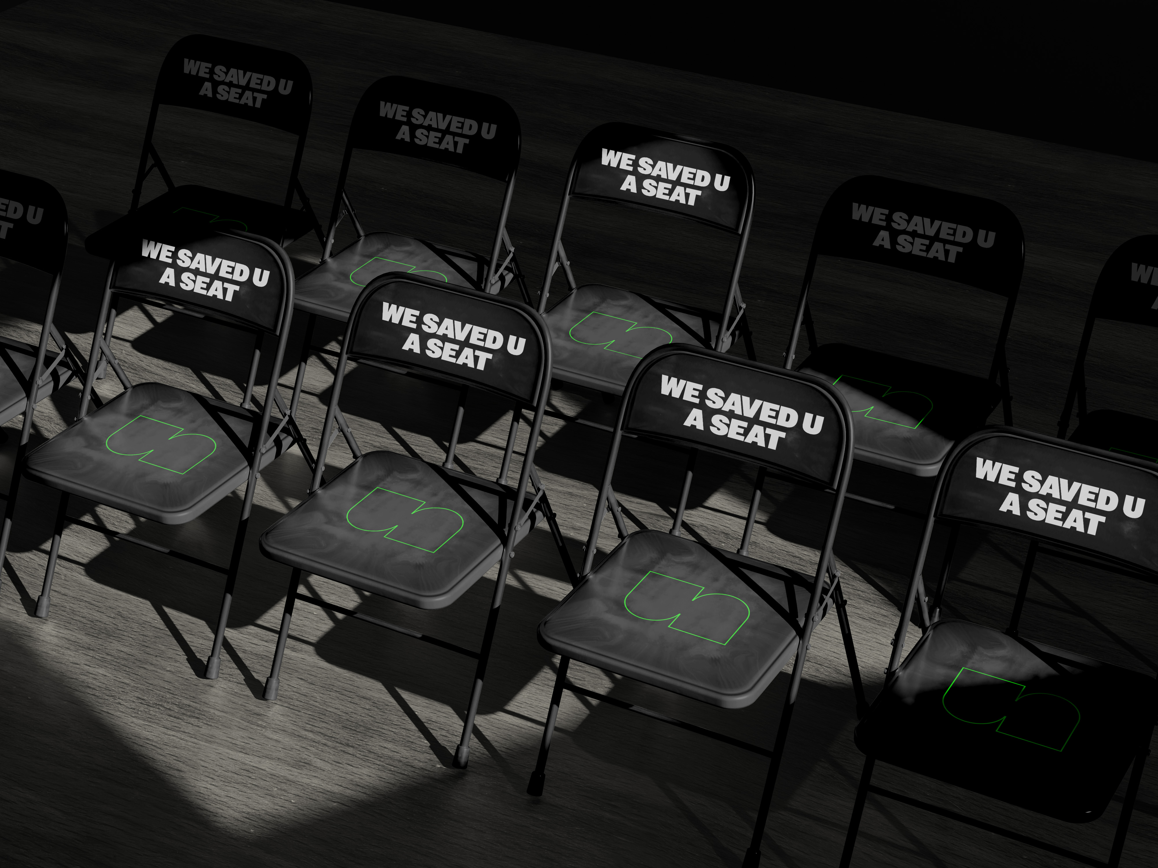
Movement Wide Application
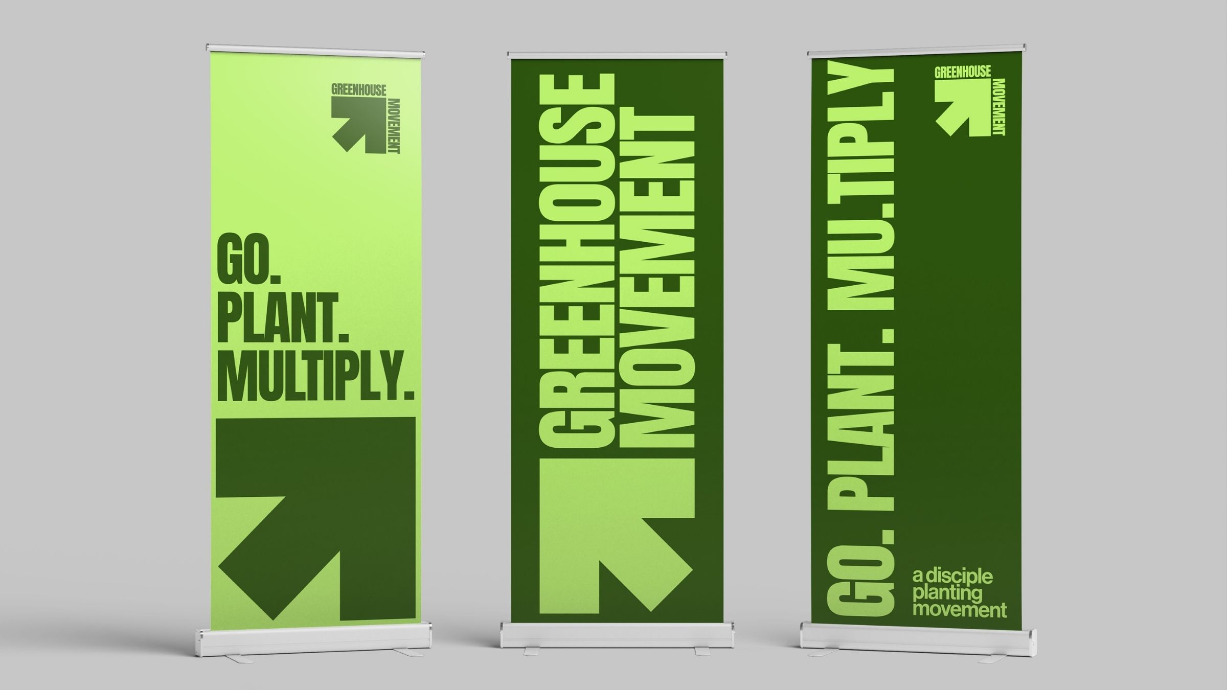
We provided a complete identity concept showing how the brand lives across environments, promotional materials, and future city contexts. This included:
• Banners and event signage
• Merch and accessories
• Digital graphics and communication templates
• Logo lockups for use across multiple city plants
The proposal ensures the brand can grow with the movement as new cities launch.
Preparing for a Multi City Timeline
The movement is targeting three major cities over the next three years.
• Orlando in 2025
• Tallahassee in 2026
• Miami in 2027
The identity system is built to function consistently in every location while allowing flexibility for contextual storytelling.
The final brand identity proposal positioned Greenhouse Movement with a clear, confident, and scalable identity system. The visuals, messaging, and tone fully capture the heart of the mission. The movement is now equipped with a bold identity ready for statewide expansion. The proposal provides clarity for mobilization, strength for communication, and a unified look that will accompany every plant from Orlando to Tallahassee to Miami and beyond.