The Challenge:
The Bay Area Church Planting Network (BACPN) needed a cohesive visual identity that could express its DNA — multiplication, movement, and a distinctly Bay Area feel. While the network was thriving in mission, it lacked a visual system that unified its message and reflected the vibrancy of its calling.
The Solution:
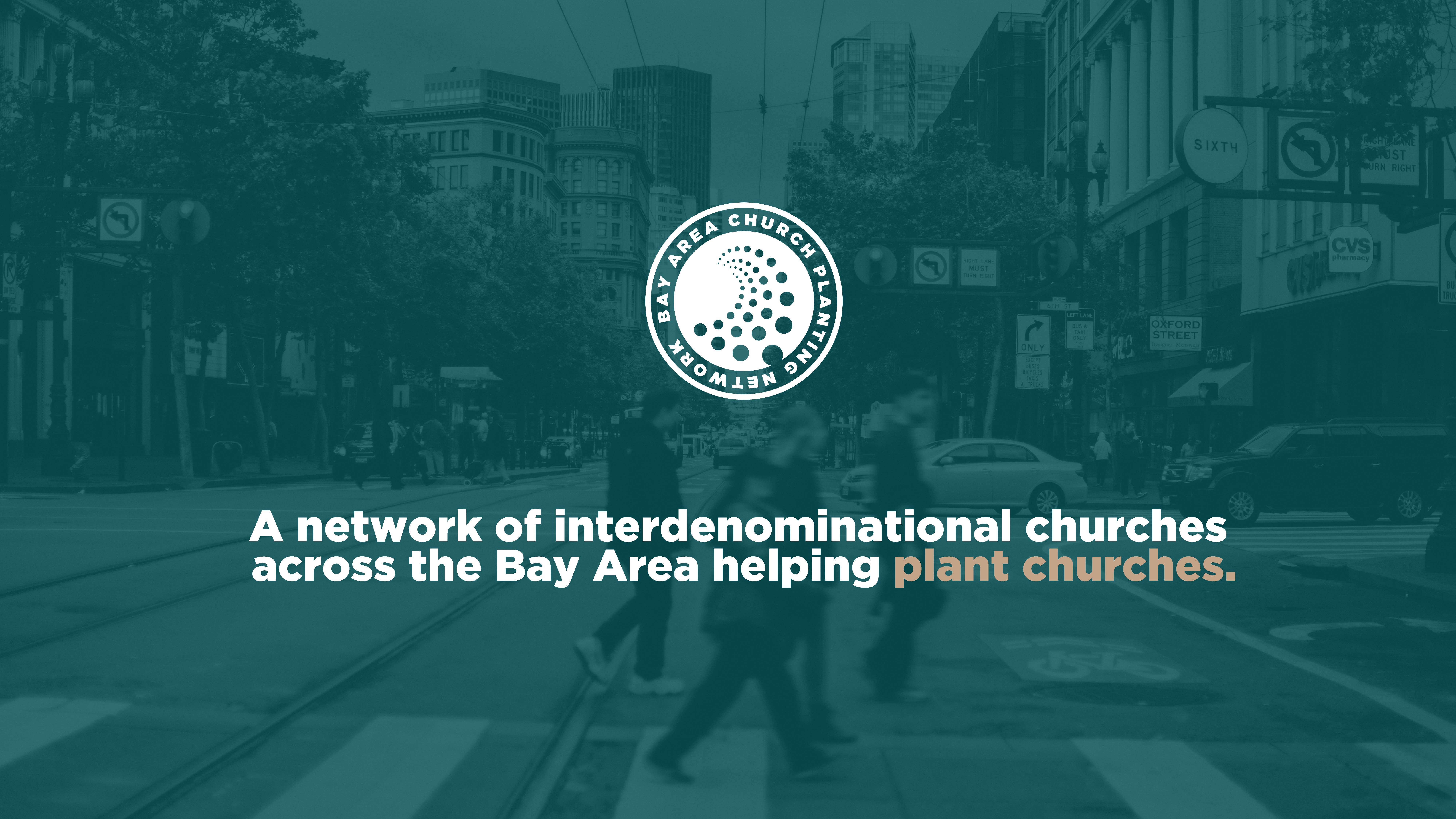
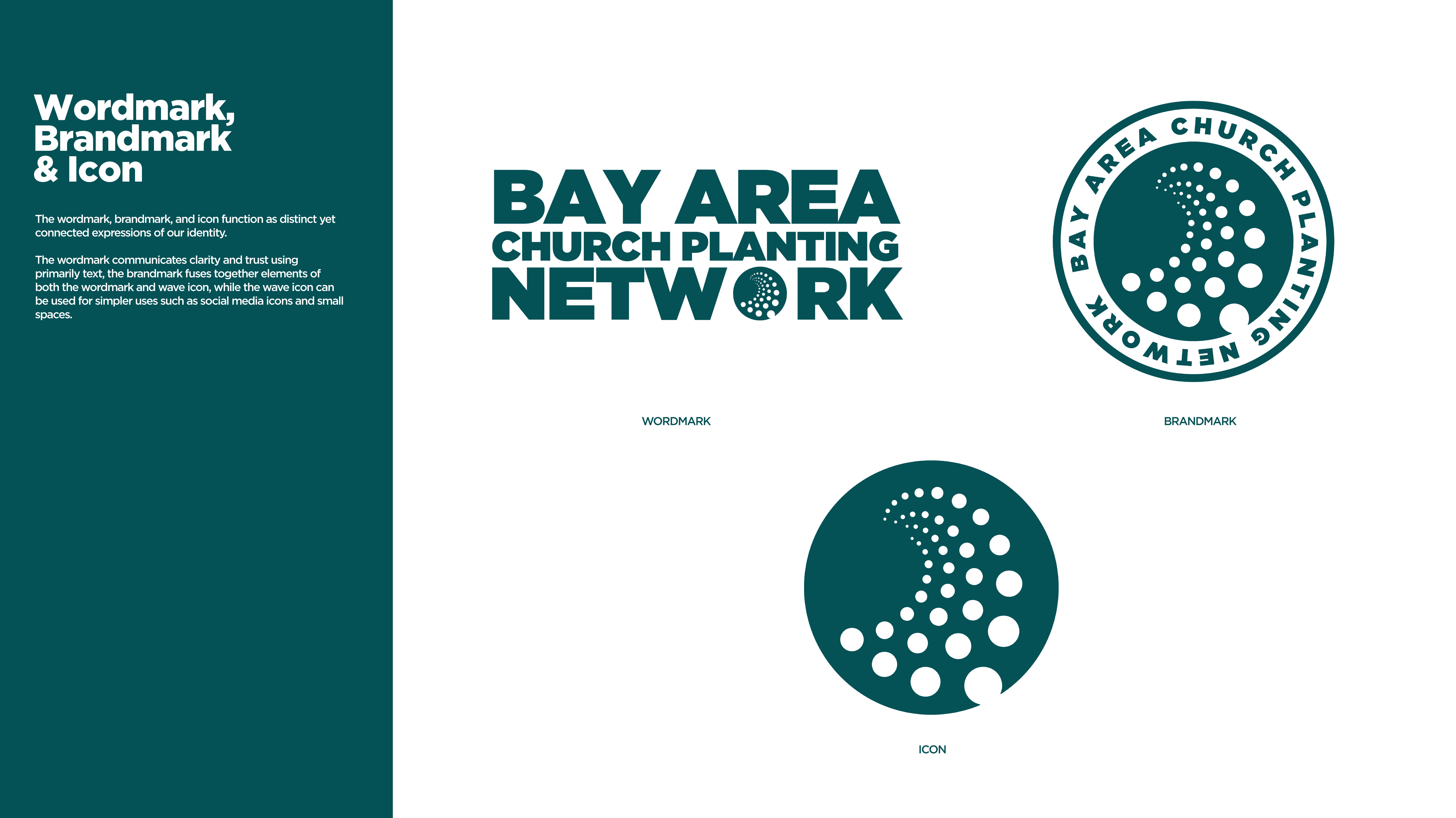
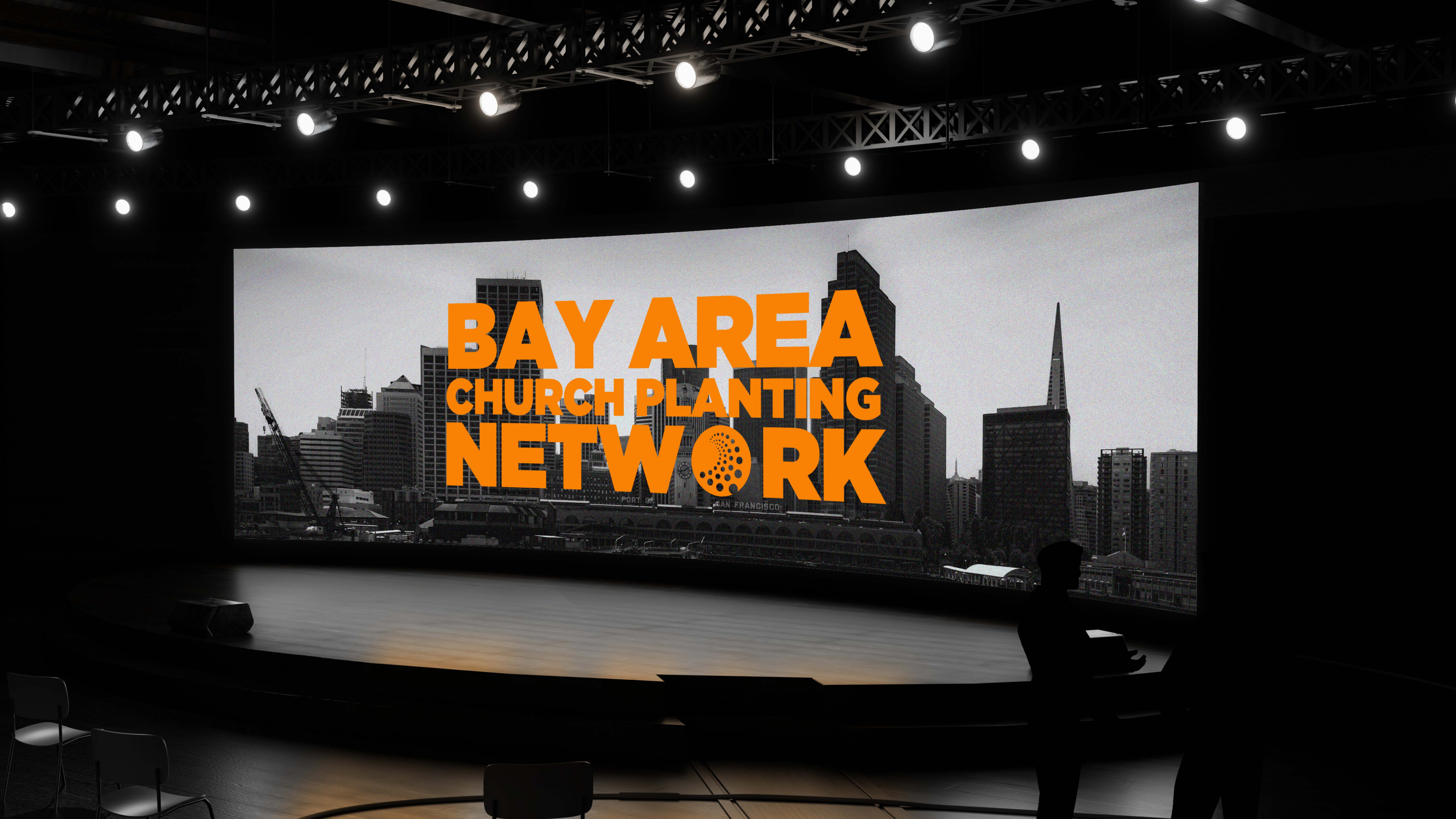
We developed a brand identity anchored in the concept of movement that multiplies. The logo features a wave, representing motion and the Spirit’s momentum, paired with multiple circles, symbolizing the ripple effect of churches planting churches across the region. Together, these elements form a dynamic, scalable mark — one that feels fluid, modern, and unmistakably connected to the Bay.
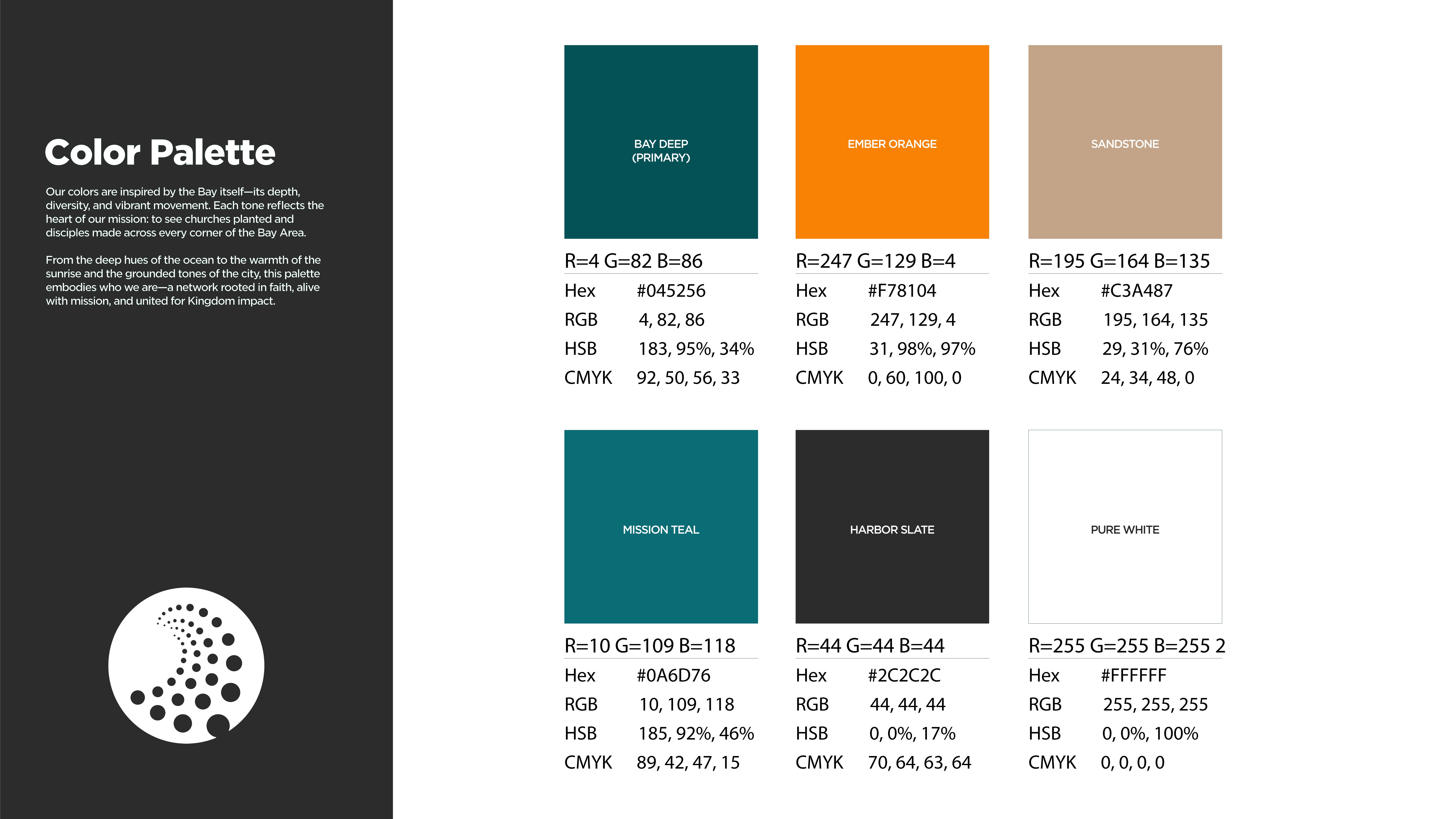
The supporting visual system — colors, typography, and graphic patterns — draws inspiration from the region’s landscape and energy, giving BACPN a bold yet approachable identity designed for both digital and print platforms.

The result is more than a logo — it’s a visual movement. The Bay Area Church Planting Network now carries an identity that mirrors its mission: to multiply healthy churches that move with purpose and reach every corner of the Bay.