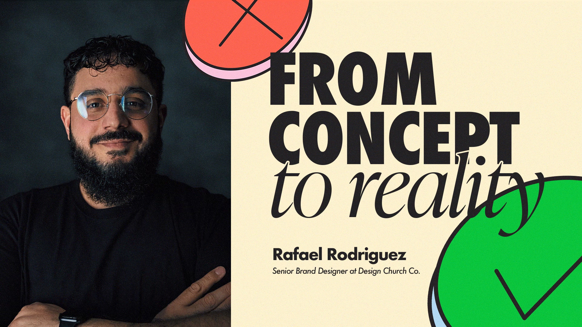
From Concept to Identity: How We Approach Brand Design
By Rafael Rodriguez, Senior Brand Designer at Design Church Co.
A designer’s job isn’t simply to make a brand look good. Making something look good is often a byproduct of good design, but it isn’t the ultimate goal. The real responsibility of a brand designer is to make the overall idea impossible to miss or misunderstand.
That’s especially true when we’re working with churches and ministries. You may not personally like every logo, typeface, or visual choice in a brand, but when you can clearly see the thought behind the identity, the purpose of the system, and the message it’s communicating, you can recognize that good work has happened. There is intentionality behind it.
That’s where I like to start: clarity.
Start With Clarity
Before I think about a logo or start building visual concepts, I want to understand what we’re actually trying to communicate. How can we make the message clear to everyone who encounters the brand? Not just visually, but through the entire atmosphere of the brand, how do we help someone understand what this organization is about?
For a church, that might mean understanding its mission and vision. For a business, it might mean understanding what it wants customers to experience and what makes it different. Whatever the project is, the first question is the same: What are we actually trying to get across?
That’s why I think branding is ultimately a form of problem solving.
It’s easy to think of branding and graphic design as the art part of the process. And obviously, the creative work matters. But underneath that creativity is a problem that needs to be solved. Maybe the client’s identity isn’t communicating their vision. Maybe their message isn’t coming through clearly. Maybe the way they’re presenting themselves no longer reflects who they’ve become.
Sometimes the client knows something is wrong but doesn’t know exactly what it is.
A church might tell us, “We need a new logo because our logo looks outdated.” That may be true, but the deeper problem could be that their identity no longer reflects who they’ve become.
Another church might say, “Everything we create looks different.” That was something we heard while working with Silverdale. The issue wasn’t necessarily that every individual piece was poorly designed. The issue was that the pieces didn’t feel like they belonged to the same church. There was no strong visual system connecting everything together.
That’s where the designer can bring value. We have to listen to what the client thinks the problem is while also asking whether there is a deeper problem underneath it. What needs to change? What needs to stay? What is already working? And most importantly, what needs to be communicated that currently isn’t?
Once that becomes clear, we can begin designing.
From Clarity to Concept
After identifying the problem, I start looking for the central idea.
I don’t want to have fifteen, twenty, or thirty disconnected ideas fighting for attention. I want to find one strong idea that can generate many different visual decisions.
That usually starts with research. I’ll identify keywords, look for relationships between those ideas, and pay attention to the tensions that exist between them. From there, I can begin moving toward a concept.
House of Disciples is a good example. There were ideas around community, discipleship, movement, growth, and authenticity. Those words on their own aren’t necessarily a concept. They’re starting points. The real work is asking what connects those ideas and what they mean specifically for this church.
This is also where I try to get away from overly literal design.
If we’re talking about growth, the first things that might come to mind are a leaf, a tree, a flower, or an arrow. Those things can absolutely work, and there are no rules in art that apply one hundred percent of the time. But if every organization talking about growth uses a leaf or a tree, it becomes difficult to create something that actually feels specific to the brand.
Instead, I like to ask a different question:
What does growth feel like?
Growth might feel like movement. It might feel like discomfort. It might feel like pain. It might feel like change or expansion.
Those questions open up a much larger creative territory. We may not end up using any of those literal interpretations, but they give us somewhere more interesting to explore.
That’s the difference between simply illustrating a keyword and developing a concept.
Give Yourself Room to Explore
Once I have a conceptual direction, I start working it out visually. That might mean sketching, experimenting with type, playing with shapes and symbols, exploring compositions, or trying ideas that are strange, overly literal, or even just bad.
That part matters.
I don’t think the first idea needs to be perfect. In fact, I think one of the biggest mistakes designers can make is judging their work too early.
As designers, we can be our own harshest critics. We might create something that other people love and immediately wonder if we could have done something better. That inner critic isn’t necessarily a bad thing, but it can become a problem when we let it shut down the creative process too soon.
The first round isn’t necessarily about finding the answer. It’s about finding what is worth pursuing.
Maybe twenty ideas become five directions. Those five become two concepts. Those two eventually become one system. Sometimes you even go back to one of the original twenty ideas and bring something forward that you initially thought wouldn’t work.
That narrowing process is where a lot of the actual design thinking happens.
Concept vs. Decoration
One of the most important distinctions I’ve learned to make is the difference between concept and decoration.
A design can be visually sophisticated and still lack a meaningful concept. It can have beautiful typography, detailed illustration, texture, effects, and interesting visual treatments, but none of those things automatically make the design conceptually strong.
I often ask myself:
If I remove the visual treatment, does the idea still exist?
Take the House of Disciples identity. The star has a purpose. It represents the North Star that led the wise men to Jesus and connects that idea to the disciples being led toward Jesus. If you remove that element, the overall idea of the identity still exists.
That doesn’t mean the star isn’t valuable. It means we understand what role it plays.
On the other hand, if we started adding four or five additional stars simply because they looked good, we would have to ask why they were there. Are they contributing something? Are they answering a question? Are they helping communicate the idea?
Sometimes we add elements because they look cool. There’s nothing inherently wrong with making something visually interesting, but we have to know whether an element is actually helping the brand.
Otherwise, we’re just adding more conversations.
And one conversation can be great. Fifty conversations at the same time become confusion.
Know When to Pull Back
Designers know how to make things interesting. We can add texture, distortion, effects, complexity, manipulated typography, layered imagery, and visual tension. Those tools can be incredibly effective when they serve the right purpose.
But sometimes they make the design worse.
I’ve definitely been guilty of adding too much texture or distortion and then looking at the final piece and realizing, “Why is this even here?”
Not everything has to be understood. Sometimes design is meant to be felt. Complexity can absolutely have a place. The right audience may understand it, appreciate it, and even expect it.
But especially when we’re working with churches, we have to be careful.
Complexity can communicate confusion.
That’s why clarity has to remain at the center of the process.
When I’m looking at a brand, I want to ask: What is the first thing someone needs to understand? What is the second thing? And then, what can I remove?
That is hierarchy.
Good design isn’t about making everything equally important. It’s about deciding what deserves attention and in what order.
A Logo Is Only Part of the Brand
One of the biggest misconceptions around branding is thinking that the logo is the brand.
A logo is important, but it’s only one part of a much larger system.
The process I come back to is:
Clarity → Concept → Expression → System
First, we clarify the message. Then we identify the central concept. Then we explore how that concept can be expressed visually. Finally, we figure out how that identity works across the entire brand.
Because the real question isn’t just, “Does the logo look good?”
It’s, “How does this idea work everywhere?”
A brand has to live beyond the logo. It has to work on a website, social media, signage, print materials, apparel, presentations, campaigns, environments, and everything else an organization creates.
The FIFA World Cup branding is an interesting example of this. There was plenty of criticism about the logo itself being too simple or minimal. But as the event developed, you could see that the logo was only a small part of the overall identity. The larger system was doing the heavy lifting.
That’s what a strong brand system does.
It takes a central idea and gives it enough flexibility to live in different places while still feeling like the same brand.
Design With Purpose
Ultimately, I think there is a deeper reason intentionality matters in our work.
At Design Church Co., we believe the Holy Spirit is the ultimate creative behind everything we do. God is the ultimate Creator, and when you look at creation, you see intentionality everywhere.
Look at a tree, an ocean, a mountain, or an animal. Even things that might initially seem strange or unnecessary often have a specific purpose. Something exists the way it does because it was designed for something.
That should influence the way we approach our own creativity.
It reminds me that I’m not the ultimate source of creativity. I’m a tool God can work through.
That’s actually part of the thinking behind my own personal logo. The mark is built from two repeated shapes that form two lowercase R’s. The lowercase lettering is intentional. I want to position myself under the leadership of God and the Holy Spirit. God is uppercase. I’m lowercase.
That idea is bigger than a logo. It represents the posture I want to have as a designer.
I don’t want to simply design because I want something to look nice. I want to create with purpose and intentionality, recognizing that God can use creative work to communicate something meaningful.
We Get to Be Part of the Process
The churches and organizations we work with are doing meaningful work. God is working through churches, pastors, leaders, creatives, nonprofits, and kingdom-minded businesses all over the world.
We get to be part of that process.
That’s something we shouldn’t take lightly.
When we work on a brand, we aren’t simply trying to finish another project. We’re helping a church or organization communicate its vision. We’re helping them tell people who they are, what they believe, and what they’re inviting people into.
That means we should create with passion. We should create with purpose. And we should create with the goal of getting the message and vision across, not simply getting the project done.
The best brand design isn’t necessarily the most complicated or visually impressive.
It’s the design that makes the idea clear.
It takes a problem and finds the truth underneath it. It takes that truth and turns it into a concept. It takes that concept and builds it into a visual language. And then it creates a system that can carry that idea everywhere the brand needs to go.
At the end of the day, that’s what we believe brand design is about.
Not just making something look good, but making the idea impossible to miss.


LET'S CHAT